Sending your data to our servers, please wait...


Oops... No results found.
Please try a different search phrase.
Digital Marketing 9 min read
Four Ideas for Optimizing Your SaaS Landing Page
Written by Ayesha Renyard
Content Writer @ Galactic Fed
Expert reviewed by Dallin Porter
Marketing Director @ Galactic Fed
Published 05 May 2021
In a past Galactic Fed post, we handed over the basics for creating a high-converting landing page—generally speaking. If you’re in the software as a service (SaaS) industry, you know it’s a different breed from others.
Since there’s no physical store, office, or clinic, you can’t woo your customers with a suave face-to-face conversation.
Plus, SaaS is not a one-time purchase. You’re not asking prospects to buy light-up sneakers. You’re asking for a long-term commitment to your “AI-driven ‘productivity’ platform that’s guaranteed to make your life easier.” (Hmm…sounds fishy.)
So it’s safe to say your first impression is important. But it’s quite the task when you’re trying to explain your software. A good sales pitch should take as little time as it takes to ride an elevator, right? So how the heck do you break down your technology to someone and convince them to commit to a monthly subscription in 20-30 seconds?
It sounds like your SaaS campaign needs a landing page and a good one at that, which is why we’re here today. Now that you know the basics of a high-converting landing page, we want to give you five high-impact ideas for optimizing your SaaS landing page and making that great first impression.
Before we dive into this list, make sure you can answer these questions:
- Who is your target audience?
- What are their pain points?
- What are you solving through your service?
- What action do you want them to take?
Answered those no problem? Perfect. You’re ready to take your SaaS landing page to the next level.
1. Incorporate “free” in your call to action (CTA)
In the SaaS industry, building trust is crucial for turning prospects into customers. In the commitment-phobic world we live in today, signing up for an annual subscription is like signing your life away. It’s a BIG deal. So to get signups, prospects need to trust you. You need to demonstrate that your service is legitimate and will solve their problems seamlessly.
How can you build trust in under 30 seconds? You offer a test drive. Whether it’s a free demo, consultation, or trial, put prospects’ commitment issues to rest by letting them see or try it first.
Plus, everyone loves a good freebie. That kind of value is hard to argue with.
How to optimize your CTA
It’s time to turn these free trials into more customers. Here are a couple of things you can do to increase your chances of converting prospects:
- Incorporate the word “free” in your button copy: Typically, CTA buttons are intentionally designed to stick out from the rest of the page. Including the word “free” in the button copy reduces the chances of prospects missing this offer.
- Put your CTA button above the fold: We recommend having several CTA buttons scattered throughout your landing page. But if you choose only to have one, it should be at the top—so visitors can see the offer without scrolling.
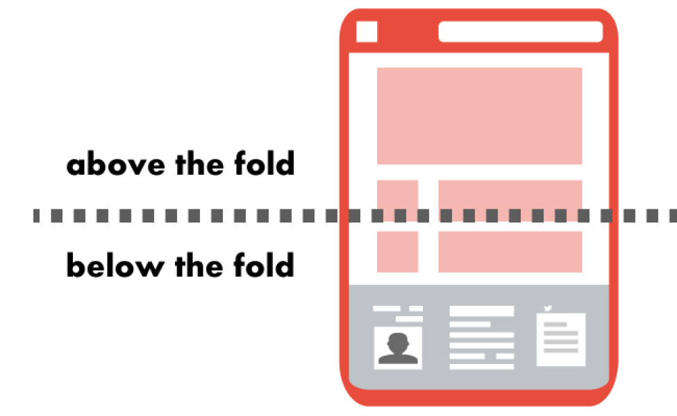
Source: Wordstream
For more general tips for creating high-converting calls to action, click here.
2. Keep it short—all of it
Your form
While we’re on the topic of your CTA, let’s discuss your form length. As a SaaS company, we get it—you need forms to generate leads. But as you probably know, form-fill pages make it a whole lot harder to convert than click-through pages.
Landing page builder, Unbounce, did a bit of digging into their customers’ landing page data and published a report: the Conversion Benchmark Report. For many industries, there’s a correlation between longer forms and lower conversion rates.
To shorten your form, consolidate some fields. Combine the form fields for first and last name, for example. Consider reducing the amount of contact information required as well—do you really need their phone number and email? Remember, once you net these leads, you can always follow up for more details later.
Your copy
In the same report, Unbounce also recommends keeping word count low—for the SaaS industry, that means under 250 words. You may be wondering how you’ll explain all your fancy features in so few words. So we say: don’t. Instead, focus your copy on the benefits to your customers. You can explain how it works later.
But what to write? Get the Galactic Fed scoop on SaaS content marketing strategies here.
Source: Unbounce
3. Follow the Z-pattern layout
Of course, you want your SaaS landing page to look good—and we recommend putting in just as much effort into your copy as your design.
But today, we’re urging you to take your design a step further and follow an organized visual hierarchy. Don’t worry, that’s just fancy talk for saying you should design your landing page according to how users view and process information online.
And lucky for you, the research has already been done for you. The findings from many eye-tracking studies have guided the development of several layouts you can use for your landing page.
The one we will talk you through today is the Z-pattern layout, which is perfect for pages with less content. Its design mimics the human eye’s route when it reads—left to right, zigzagging top to bottom. Kind of like this:
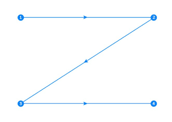
Source: Instapage
But don’t feel the need to follow this pattern to a tee. The horizontal lines do not have to be exactly horizontal, and there can be multiple Z’s throughout the page. Just make sure that:
- The top horizontal line includes the main components you want visitors to focus on first.
- The diagonal line should feature any piece of information that leads to your CTA button.
- The bottom horizontal line should highlight the CTA at any point along this line.
If you’re looking for an example of how this looks in the wild, Facebook (as per usual) does a pretty good job here:
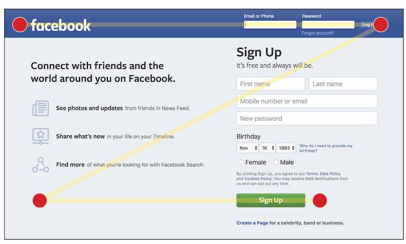
Source: Blue Frog Marketing
4. Upgrade your thank you page
Let’s say someone fills out your form to download an ebook, book a demo, or sign up for your service. Is that the end of the marketing funnel?
If you believe it is, we think you may have missed our last blog post on turning your thank you page into a conversion tool. A page that simply says “thank you” is missing out on a whole lot of conversions.
For SaaS, here are four things you could do to optimize your thank you page:
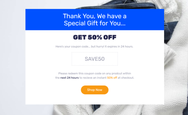
- Offer a discount: If you scored a demo request, offer them a limited-time discount. This will create urgency to move along the customer journey—to book that demo and ideally sign up (instead of being forgotten).
Source: OptinMonster
- Link to more resources: Perhaps the goal is to get top-of-funnel conversions, like downloading an ebook. If visitors convert, it means they find value in your resources, so link them to similar content! For SaaS especially, you need to warm up your leads before getting those subscription signups.
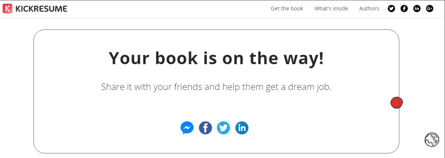
- Include a share button: Or, you could get them to share your resources with others! If they like it, odds are they have friends and family who would too. And just like that, you increase your brand awareness.
Source: Eleken
- Feature social proof: Customer churn is a huge challenge in the SaaS industry. Even though you may have scored a signup, it doesn’t mean they’re locked in as a longtime customer. In fact, many people experience buyer’s remorse immediately after making a purchase. Reassure new customers that they made the right decision by including review scores and customer testimonials.
And don’t forget to test!
We’ve said this once, and we’ll say it again—test the elements of your landing page, so you know what’s getting people to convert. Guessing will only get you so far.
Need some ideas to get you started?
Play around with your CTA button. Placement, copy, color, and shape.
Test your form length. Maybe for your business, four form fields make it short enough. Others may perform best with two. At this point, who knows?
Try out different layouts. For example, test the Z-pattern against others, such as the F-pattern.
Create different post-conversion experiences using your thank you page. What’s engaging your customers more—social share buttons or links to more content?
** Need help with execution? That’s where we come in. Let’s turn your SaaS landing page into a converting machine.**

Ayesha Renyard
Content Writer @ Galactic Fed