Sending your data to our servers, please wait...


Oops... No results found.
Please try a different search phrase.
Digital Marketing 11 min read
How to Create a High-Converting Landing Page
Written by Ayesha Renyard
Content Writer @ Galactic Fed
Expert reviewed by Dallin Porter
Marketing Director @ Galactic Fed
Published 17 Nov 2020
In past blog posts, we’ve shared tips and tricks on building strong ad campaigns. You’ve taken this knowledge and created some stellar ads—scoring click-throughs left, right, and center! But your campaign isn’t performing as well as you thought. Something’s up, and it’s not your conversion rates.
So we’ve gotta ask—did you set up a landing page?
A landing page is a standalone web page created specifically for a marketing or advertising campaign. It’s where a prospect “lands” after they click on an advertisement and should reflect the same conversion goal as the ad, such as sales or lead generation.
If your ad links to your general website or e-commerce store, your prospect may feel lost and wind up bouncing. One second they’re pursuing an offer on Baby Yoda cupcakes; the next minute, they’re on a bakery’s home page—with no Baby Yodas in sight! The disappointment.
It’s time to capitalize on those well-earned click-throughs.
So next stop on your paid media journey is how to build a high-converting landing page.
All aboard!
The Five Building Blocks of a Landing Page
1. Establish & highlight the value proposition
Before you create your landing page, you need to define your value proposition. What is a value proposition? It’s the value you promise to potential customers—which should be promoted consistently across your ad and landing page. If you’re advertising that you’re the only bakery in Seattle offering up Baby Yoda cupcakes, then your landing page should focus on that (and only that). Write down your value proposition on a sticky note and keep it close to your computer. You’ll be returning to it often.
Can you spot the value proposition in this Google ad by SaaS company Outwrite?
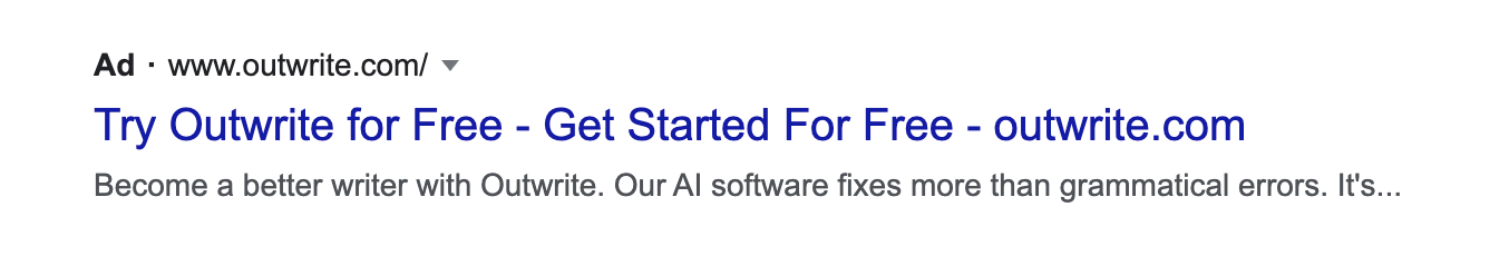
Prospects are promised two things in this ad: becoming better writers and accessing a free trial. When the prospect clicks the link, they are right where they need to be to claim the offer. Plus, the landing page goes into greater depth about how Outwrite’s service improves the prospects’ writing. (Ie. writing with an impact, and turning ideas into powerful sentences.)
When it comes to landing pages, pepper your value proposition throughout the landing page—not just your headline. Heck, you can even plug it in alongside your call to action at the bottom. You may feel like you’re repeating yourself, and that’s totally okay. Actually, it’s encouraged.
2. Make a statement with your hero image
Prospects will want to see this value proposition in action, and that’s where your hero image comes in. A hero image (also known as a hero shot) is a banner image or video that presents your product or service. The audience’s eyes will immediately draw to these visuals, so this is your first chance to impress your prospects with what you offer.
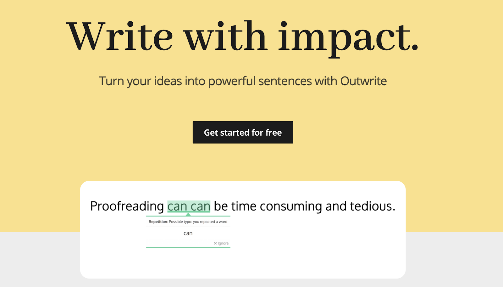
Source: Outwrite
Outwrite’s hero image is a video that shows (not tells) the reader about the value of proper editing through a demonstration of its proofreading capabilities. Spoiler alert: bad grammar can be embarrassing and leave a bad impression.
Do you know what also leaves a bad first impression? A poor hero image. Treat it like a blind date—appearances are everything. Here are some best practices when choosing a hero image:
-
High-quality resolution: This may seem obvious, but make sure your image quality is top-notch. When resizing, the rule of thumb is that it’s totally okay to size down, but never up—or that’ll bring on some low-quality fuzz.
-
Fast-loading images: Loading time is super important for conversions. If it’s too slow, your prospects will go. Lucky for you, this is controllable. Don’t depend on the browser to resize your image; resize and compress the image yourself. We encourage you to experiment with different file types (PNG vs. JPG) to find that sweet spot between image quality and load times. Curious how your page is loading on different devices? Test out your landing page load time using this tool.
-
Clean design: Your hero image will likely have some copy on it. The copy and visuals should complement one another, not overpower each other. To make sure that the viewer isn’t overwhelmed by your hero image, avoid stuffing it with competing patterns and colors. Channel your inner Marie Kondo and keep it crisp and organized.
3. Emphasize the benefits
Now it’s time to fill your landing page with some content. Where do you start, and when do you stop? Although it’s tempting to start with all the amazing features it has—and how it outperforms your competitors—we recommend focusing your content on the benefits to consumers.
Compare these two statements:
Our multivitamin supplement has 25 vitamins and minerals in it. That’s 10 more than the next leading brand!
Vs.
Improve your immune system, eyesight, metabolism, and muscle function with our multivitamin supplement!
The first statement sounds impressive, but will it resonate with the consumer? Prospects are always scanning for what’s in it for them. We’re not saying you should completely leave out the features. But leading with the benefits will keep prospects interested as you guide them to your CTA.
On the Outwrite landing page, they do just that. First, they lead with the benefits:
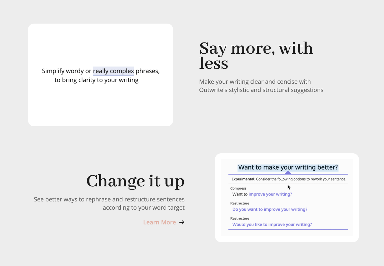
Then, they tell the prospect how they do it:
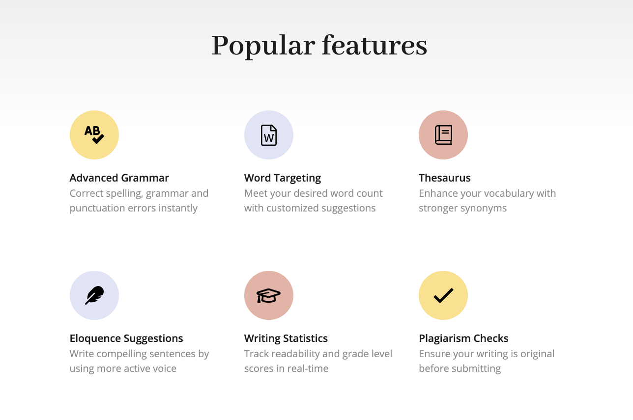
Consider if these two blocks were swapped. As a prospect, would there be much meaning behind the features if you didn’t know what it did to your copy?
Tip: To make it super easy for the reader, list the benefits using numbers or bullets!
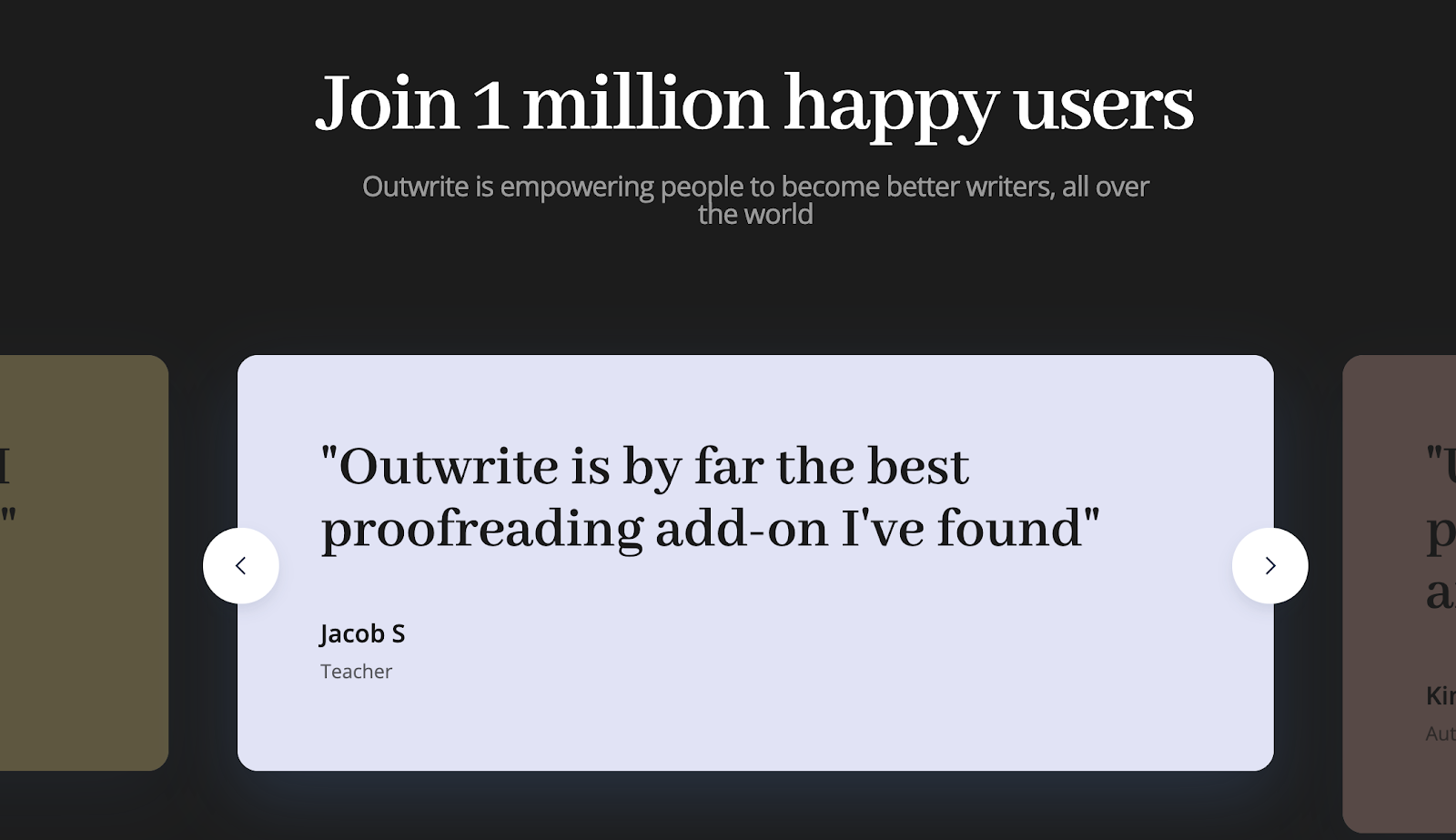
4. Incorporate social proof
When it comes to increasing conversions, social proof is truly your power move. Social proof is a psychological and social phenomenon where people assume others’ actions in an attempt to reflect correct behavior for a given situation.
How is it used in marketing? Well, think of all those kitchen appliances taking up space in your pantry—that Instant Pot multi cooker, Magic Bullet blender, and Ninja air fryer. Why’d you buy it? Or should I ask, who influenced you to buy it? These kitchen appliances didn’t fly off the shelves because we all independently thought at the same time that they’re a great buy. We bought it because we heard they were a great buy.
A recommendation from someone—whether it’s a friend, family member, or Martha Stewart—can be very persuasive. If it’s coming from a credible source, it acts as a seal of approval. In a world full of choices, social proof makes decision-making a whole lot easier. Surprise, surprise—companies that leverage social proof in their landing pages have very high conversion rates.
What does social proof look like on a landing page?
- Direct quotes from customers
- Case studies
- Video interviews or testimonials
- Logos of customer companies
- Review scores, ratings, or badges
Outwrite uses several forms of social proof on its landing page. First, it demonstrates its usability by incorporating logos of familiar platforms, such as Google Docs and Microsoft Word. Although we may never have heard of Outwrite, we do know these brands, which adds credibility to its own name.
It then tells the prospect that it already serves 1 million happy users—removing the risks associated with trialing a new product. If 1 million others are happy, why wouldn’t you be happy with its service?
Outwrite doesn’t stop there, though. The landing page cites customer testimonials to validate its service further; and by adding their job titles, they call out their target audiences. Hey teachers, authors, and publishers—your peers are all using Outwrite, so you should too!
5. Seal the deal with a clear call to action
We just stacked the first four building blocks of a high-converting landing page. But what actually guides the conversions? The fifth, and arguably most important building block, is the call to action. The call to action (CTA) elicits the specific action or response you desire from your prospects and should reflect your conversion goal. Typically landing pages fall under two conversion goals: lead generation or sales.
Accordingly, you will present your CTA in the form of a click-through form or a button. You can repeat the CTA several times on the landing page, but it should remain the same to avoid confusing your prospects. Outwrite’s CTA is “Get started for free,” which they repeat at the bottom of the landing page, so prospects don’t need to scroll back up to convert. Convenience creates conversions!
CTA’s are small but mighty. Here are some tips when crafting yours:
-
Use clear action verbs: “Learn more” simply doesn’t cut it anymore. Tell them what to do and how to do it. If you want them to buy your product, empower them to do so: “Buy Baby Yoda Cupcakes.”
-
Create a sense of urgency: Throughout your landing page copy, create a sense of urgency. Maybe the offer will expire, or it’s only available while quantities last. Then, add some punch to your CTA by telling them to claim their offer “now” or “today.”
-
Use possessive pronouns: This landing page wasn’t created for the masses! This offer was specially made for each of your prospects. (At least, make it seem that way.) Using possessive pronouns such as “yours” and “my” will create that 1:1 connection: “Claim my offer!”
-
Offer a discount: Remember that thing called value? If you’re offering additional value through a discount, or something free, your CTA will be pretty hard to resist.
Now Let the Conversions Stack Up
When it comes to creating a landing page, it can be easy to stray from its purpose, so remember to stay on route. What are you promoting? How does it deliver value? When all the components align, your prospects will have nowhere else to go but to your CTA. Need a co-pilot? Reach out to us! We’d be happy to join you.

Ayesha Renyard
Content Writer @ Galactic Fed